Tuesday, April 23, 2013

Roughing the Draft

Layout


I wasn't really sure what to do for the three rough layouts so I just started to throw stuff together, but by the end of the third one I was starting to get a hint of what I could play with and a better mental image of what I wanted to create was coming together. Then the critiques also really helped me out on what I need to play with and develop further. Now to just work on it.


Wednesday, April 3, 2013

Cardboard Bow Tie

Cardboard Bow Tie


So here are the pics for the prototypes. When I put together the cardboard prototype I came across several flaws and ideas on how to put together the wooden one, which I guess is the idea of a prototype, anyway moving on. The first issue I came across was using the jig saw to cut out the bow ties see through hole. The issue was with the saw but I know to look out for it now. The other issue was the problem of having a recessed bow tie spot. I talked to one of the aides and we came up with several different solutions from chiseling it out to cutting it in half and sanding it down which is what I tried with the cardboard one. 
The plan is to cut and plane the pieces tomorrow and glue everything. Then get a large chunk of it done over the weekend and varnish it on tuesday. 


Tuesday, April 2, 2013

Preliminary Sketches

First Sketches


           These are the initial idea sketches I did for the box project. The first sketch I did was the bow tie and it was the idea I put the most effort into because It was initially my favorite idea, other than the air one that is. I really liked the idea of making a checkerboard bow-tie and I am sad that I dont get to play with that. 
           The second idea or the second object I had was a small round rock. I had several different concepts with it the first one being that I have a very organic shape that mimicked the rock itself. The other idea for the rock was to have a very unadorned or shapeless exterior and then have the inside of the box have a perfectly shaped spot for the rock. 
           The last idea I had was to make a birdcage for a fake bird that I had acquired for a sculpture piece. The idea was to have the box be the birdcage which I though would be fun to do but very difficult to pull off.     


Monday, April 1, 2013

A Box that Holds Air

A Box that Holds Air


So I finally got around to posting about the project, kinda. The day after we first brought in our objects I was in sculpture and had an idea, a silly idea, but an idea nonetheless. I though it would be fascinating to have a box that holds air, at first I though maybe just a wispy looking thing that kinda represents floating or something but then I realized it would be so much more fun to actually have it hiss with a release of air when you uncork it. The original concept was a bottle but I fell in love with the irony of the name "A Box that Hold Air". I also like the idea of having "vintage" bottles of air from different places just sitting around. "Why yes lets open a bottle of 2012 colorado air, a very smoky smell that year."


Chalking

Chalking


           So I decided to chalk some the other night and I ended up drawing the match and then the next morning I drew some more and then the next night I had another idea and I was really bored. Then I decided to restart but with an actual design in mind to an extent. 
          So the new idea is to have a gun or some object pointing where the cigarette is pointing towards the rest of the wall. From the gun I want everything exploding along the wall. But first I need to wash the wall and buy chalk or oil pastels.  
          Soon I will post about the project double promise.


Wednesday, March 27, 2013

Do you even lift?

Photoshoped


            So I used to photoshop a lot because I was in year book and newspaper so I did lots of photoshopping. I had to learn by trail and error, mainly from online tutorials and the like. One of the first things I got really good at was using the pen tool, I did all the Cut Out Backgrounds for the yearbook. The issue with the pen tool is that it dosent work for certain things, things like hair or fuzziness it cant deal with, its also kinda slow. So this was an experiment with layer masks and some new tools, my hair was still a pain to cut out but it at least turned out pretty well. The tattoo was a later addition in support of the equality thing.
            The next post will be about class, I guarantee.  


Wednesday, March 13, 2013

Inspiration a day to late...


         I was lying in bed the night after the project trying to figure out what I could have done differently for the chair project. And after a while I realized that the whole issue was what the chair was based off of, I needed a different relationship. Then it came to me I should have done my high school mentor Joe Glotzbach, pictured above. Mr. G was my high school's drama teacher and one of my boyscout troop leaders. He passed away several years ago due to cancer but he left behind so many memories. Some of my fondest memories of him are when Tim (the person I did the original essay over) and I had forensics duet practice. We would perform for him and when we were done we would say that we were good for the day, Mr G would then just give us this look that was like you know very that your not done, you can do so much better, you and I both know it. And then would say that we would go practice again and then perform for him again and then he would give us that look again and then we would practice until we had it perfect. 
        I also have many fond memories of Mr. G from boyscouts and it is in no small parts thanks to him that I got my Eagle Scout. He was meticulous in his attention to detail and his faith in people, he was one of the best teachers I ever had even though I never took one of his class's. 
        The chair would have been small as his lifestyle was simple and he was content with his lot in life. I would have perhaps been a stool or a simple seat, where the chair would have stood out would have been in the detail around the base of it. I would have used a knife to cut away the top and middle layers of cardboard to create a series of images that would have represented my memories of him.
        Well that was a lot of rambling but the idea was driving me crazy and I had to get it out. It seems that inspiration came to me just a little to late on this project hopefully it wont happen again.

Monday, March 11, 2013

Kendal Buster

 Kendal Buster

Kendal Buster’s works are a mixture of science and art. Everyone draws inspiration from somewhere, I tend to draw inspiration from everyday life or whatever catches my fancy. The great thing about Kendal Buster’s work is that it is all inspired by her science background making most of her pieces coherent, unlike my work which is nonsensical and random at best. When you hear the name Kendal Buster you immediately know what type of art you will be looking at.
Kendal Buster’s art is fascinating in its large billowing manner. Most of Buster’s works are frames with some type of material draped or placed within it. Her work, because it is inspired by her scientific biology background, seems as if it is almost undulating or living and breathing in its own regard.  

Martin Puryear


Martin Puryear

Martin Puryear’s work is fascinating, his pieces are very abstract in context. His work as he states in the intro to his site is non representational, yet at the same time they allude to objects in real life. Giving his work this odd mix of non representational allusion. I think that his art is interesting, he strips it down to such a point that you get to looking at the shape or the form as opposed to minute details. I ended up looking at the direction of the piece and it’s movement as opposed to what it possibly meant. I also looked at the material and was interested in how he manipulated wood in several different instances. It was also intriguing the combination and form that he put in some objects and how he placed certain works so that they trailed into the distance.

Another fascinating concept about Martin Puryear’s works was how some of them were incredibly simple in nature and how other were not. He had many pieces that are a single object or a single piece that loops back on itself or maybe a wooden form lying on the ground. While others had intricate weaving or were woven into a fascinating form and some had odd wooden angles while more had several compounded features. Giving a fascinating contradiction to his work.

Saturday, March 2, 2013

Mini Chairs


These are some models of potential cardboard chairs. The most difficult part of making my chair so far are the supports. The supports are tightly rolled cylinders, the issue though is that it is incredibly difficult to tightly roll cylinders by hand. My next attempt will be to construct or find some small metal pipe that I can roll it around.  


Sunday, February 24, 2013

Snow


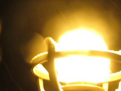
Behind on blogging and can't think of things so here's some pictures I took the first time it snowed, not the most recent. I thought i'd throw some of the mess ups (there were way more) in with the others since most of the fun of taking these pictures was standing out in the snow for 20 minutes without gloves on acting like I know what I was doing standing in front of the building next to Dyche with the statues. It took awhile getting the settings right and I also had to focus the camera on a dark point lower down and then raise it up really quickly and take the picture before it auto adjusted to the brightness. Anyway SNOW!

Monday, February 18, 2013

Gif-fiti


I found this while browsing the internet and it fascinated me so I researched the artist and did some reading about these types of particular pieces that he did. He talked about getting the idea for it from seeing so much art online, he said that so much artwork nowadays is only seen online so he decided to make artwork that was tailored to the internet but based in the physical world. So he made a graffiti gif, a real world looping image. The end product is mesmerizing and inspiration inducing. 

Wednesday, January 23, 2013

Steam Stacks

Steam Vents


I saw the steam stacks and I immediately thought it would be a really fun anamorphic picture collage with the tall stacks and then with lots of flowing steam coming off them. This idea has several different Ideas the first of which involves Just the the stack and one cloud of steam flowing off with a bunch of photos into a white background. The second Idea is similar to the first in the stack regard but then I include steam coming off the stack at different times of the day and with different winds. and the last idea would be a close up of it straight on, then moving up to see the whole tower with a fisheye effect and seeing the top wreathed in a cloud of steam.